The logo
A small entrance to the things I make.
Moving logo
Warm light drifts through the arch and follows you.
The mark
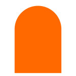
I think of the arch as an entrance. A rounded top and two straight sides give this collection of projects a recognizable starting point, even without a name beside it.
Most of this site is black, white, and quiet shades in between. The orange gives the arch a place of its own, and the same shape works in a single color, so it can stay small and still be recognized.
On the home page, the outline stays still while light moves inside it. Hover over the mark to stir it again.
Construction
- Shape
- A half circle on a rectangle
- Grid
- 16 × 23 units, symmetric about the center
- Top
- Radius 8, half the mark's width
- Body
- 16 × 15 units with square corners
Clear space and size
- 64px
- 32px
- 16px
- Clear space
- 8 units, half the width
- Minimum size
- 16px tall on screen
- Orange
- #FF6900 on neutral surfaces
- Black
- #000000 for one-color layouts
Files
One vector mark on a transparent background. The brand page has the black version and usage notes.